import numpy as np
from sklearn.model_selection import train_test_split

X, y = np.arange(10).reshape((5, 2)), range(5)
X_train, X_test, y_train, y_test = train_test_split(X, y, test_size=0.33, random_state=42)For the most part, Python dominates the Data Science landscape. In particular, there are a few core libraries that have providing the ground work for Python’s flourishment, namely numpy, pandas, matplotlib and scikit-learn. Given their popularity, they’ve become the primary tools leveraged by most working data scientists day-to-day and as a result, many have grown accustomed to common patterns that arise within these libraries’ api’s.
Here is one example: it is second nature to many to reach for that random train/test split when faced with a machine learning problem (this comes directly from scikit-learn’s docs).
Another example arises when performing EDA. pandas’ df.corr() goes so smoothly with seaborn’s sns.heatmap(), the two are basically joined at the hip.
import pandas as pd
import seaborn as sns

df = pd.read_csv('https://archive.ics.uci.edu/ml/machine-learning-databases/wine-quality/winequality-red.csv', sep=";")
sns.heatmap(df.corr())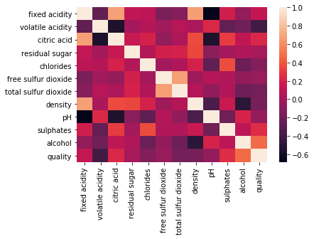
Wrapping Py-data patterns into DataFrames
Data Science is, ultimately, about the data. So why not add more core functionality to the pd.DataFrame itself? With Pandas’ custom accessors, we can add any arbitrary method to a pd.DataFrame! This is a useful technique to spend less time writing ubiquitous code and more time solving problems.
Train/Test splitting
Let’s address the first example above. Typically when you are faced with a machine learning problem, you’ll load your data into a pd.DataFrame. After some EDA, you’ll want to split your dataset into a train and test set (well, you probably want a validation set too, but that’s beside the point). In order to do so, you likely import sklearn’s train_test_split and break your pd.DataFrame into an X and y, etc, etc. Instead of all that overhead, what if making a train/test split were this easy?
df = pd.read_csv("...")
X_train, X_test, y_train, y_test = df.splits.train_test(y_col="target")
It can be.
The solution is to build a custom pd.DataFrame accessor. Pandas makes this super easy. All we have to do is write a small class that contains the typical train/test split functionality, then decorate it with @pd.api.extensions.register_dataframe_accessor("splits"), where splits is the name of the attribute we’ll add to a DataFrame. Here’s some code.
from sklearn.model_selection import train_test_split

@pd.api.extensions.register_dataframe_accessor("splits")
class Splits:
    def __init__(self, df):
        self._df = df

    def train_test(self, y_col: str="target"):
        X_cols = set(self._df.columns) - set([y_col])
        X, y = self._df[X_cols], self._df[y_col]
        X_train, X_test, y_train, y_test = train_test_split(X, y, test_size=0.33, random_state=42)
        return X_train, X_test, y_train, y_test
df = pd.read_csv('https://archive.ics.uci.edu/ml/machine-learning-databases/wine-quality/winequality-red.csv', sep=";")
X_train, X_test, y_train, y_test = df.splits.train_test(y_col="quality")
print(X_train.shape, X_test.shape, y_train.shape, y_test.shape)(1071, 11) (528, 11) (1071,) (528,)It may only be a few lines of code saved, but it can allow for a significant productivity boost.. particularly if you have to google those few lines of code every time.
But we’re just getting started, there is a lot of room for customization. Imagine that you’re working with an imbalanced dataset (we’ll use scikit-learn’s breast cancer dataset) and are looking for a quick way to perform stratified k-fold cross validation.
Code
from sklearn.datasets import load_breast_cancer

breast_cancer = load_breast_cancer()
X = pd.DataFrame(breast_cancer.data, columns=breast_cancer.feature_names)
y = pd.DataFrame(breast_cancer.target, columns=["cancer"])
df = pd.concat([X, y], axis=1)
# okay so it's not that imbalanced.. but you get the point
df["cancer"].value_counts()1 357
0 212
Name: cancer, dtype: int64We can create another custom DataFrame accessor to help us out. This time, however, we’ll make it a generator so that it mimics the behavior of sklearn.model_selection.StratifiedShuffleSplit.
{% include info.html text=“Note: below, I create an entirely new class for clarity, but it’d be advised to implement both the train/test and stratified train/test split in a single class.” %}
from sklearn.model_selection import StratifiedShuffleSplit

@pd.api.extensions.register_dataframe_accessor("splits")
class Splits:
    def __init__(self, df):
        self._df = df

    def stratified_train_test(self, y_col: str="target", n_splits=5, test_size=0.33, random_state=0):
        X_cols = set(self._df.columns) - set([y_col])
        X, y = self._df[X_cols], self._df[y_col]
        sss = StratifiedShuffleSplit(n_splits=n_splits, test_size=test_size, random_state=random_state)
        for train_index, test_index in sss.split(X, y):
            yield X.iloc[train_index], X.iloc[test_index], y.iloc[train_index], y.iloc[test_index]
Code
from sklearn.linear_model import LogisticRegression
from sklearn.metrics import recall_score
Now, we only need to load up our model and our dataset, and we can loop through each stratified fold right out of the box. Here is a use-case, evaluating Logistic Regression’s cross-validated recall.
recalls = []
strat_kfold_df = df.splits.stratified_train_test(y_col="cancer")
for X_train, X_test, y_train, y_test in strat_kfold_df:
    log_reg = LogisticRegression()
    log_reg.fit(X_train, y_train)
    y_preds = log_reg.predict(X_test)
    recalls.append(recall_score(y_test, y_preds))

print(f"5-fold stratified cross-val mean recall: {round(np.array(recalls).mean(), 4)}")
5-fold stratified cross-val mean recall: 0.9475EDA
When doing an exploratory data analysis, these “Py-data patterns” rear their head nearly everywhere. You are almost always going to want to look at some histograms, pairwise plots, or at least summary statistics. The Python data science toolkit does a great job of making these sort of things easily accessible, however, it’s often necessary to import and stitch together functions from multiple libraries, or chain together five or six lines of plt.format_something(). Why not attach this EDA code directly to the DataFrame?
For instance, you may find yourself often reaching for the heatmap of correlations within a DataFrame (shown above). In many machine learning applications, however, you aren’t really looking for the correlations between all variables, only the correlations with the target variable. We can create a new DataFrame accessor to give us precisely that.
Code
import matplotlib.pyplot as plt
import matplotlib.patches as mpatches   # for forcing legend in corr_plot
Code
@pd.api.extensions.register_dataframe_accessor("eda")
class EDA:
    def __init__(self, df):
        self._df = df

    def _corr(self, y_col):
        corr_df = self._df.corr(method="spearman")[[y_col]].drop(index=y_col)
        corr_df["abs_corr"] = corr_df[y_col].abs()
        corr_series = corr_df.sort_values(["abs_corr"], ascending=False)[y_col]
        return corr_series

    def corr_plot(self, y_col="target"):
        # set up
        corr_series = self._corr(y_col)
        colors = (corr_series>0)
        pos_color, neg_color = "blue", "red"
        pos_label = mpatches.Patch(color=pos_color, label="positive")
        neg_label = mpatches.Patch(color=neg_color, label="negative")

        # plotting
        fig = plt.figure()
        plt.bar(corr_series.index, corr_series.abs(),
                color=colors.replace(True, pos_color).replace(False, neg_color),
                alpha=0.75)
        plt.legend(handles=[pos_label, neg_label])
        plt.ylabel("abs(corr)")
        plt.xlabel("features")
        plt.tick_params(axis='x', labelrotation=50)
        plt.show()
df = pd.read_csv('https://archive.ics.uci.edu/ml/machine-learning-databases/wine-quality/winequality-red.csv', sep=";")
df.eda.corr_plot(y_col="quality")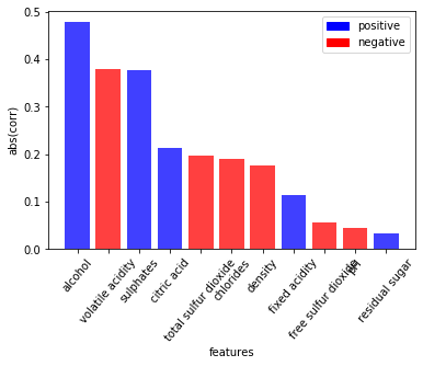
Even though this is a standard, nothing-special-about-it bar plot, it took about 20 lines of code. That’s a lot. It’s a serious bottleneck to have to search through Matplotlib’s docs to remember how to rotate the ticks on the x-axis. Sure, this plot isn’t perfect, but for a single line of code, there’s a lot of information displayed - allowing you to quickly gain an understanding of which variables may be most predictive of your target. This type of rapid iteration is a differentiator between a seasoned and a mediocre analyst.
There are many potential attributes that could be added the DataFrame. My guess is that most data scientists make use of a handful of patterns across all their projects. If you’re working with pd.DataFrame’s every day, it is worth turning a few of your common programming idioms into new DataFrame attributes. Spend your time working on the the good stuff!